Original version:
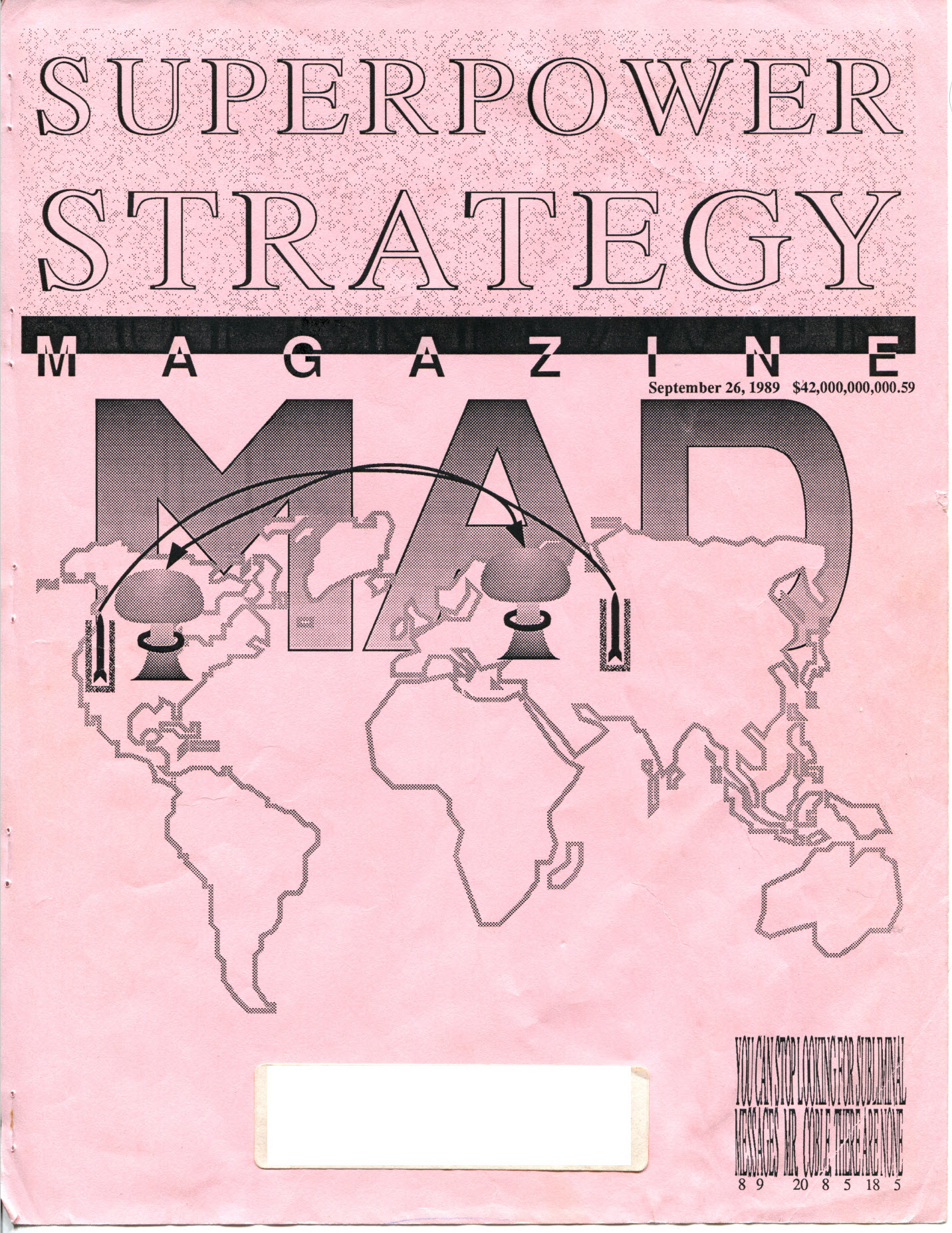
Front Cover
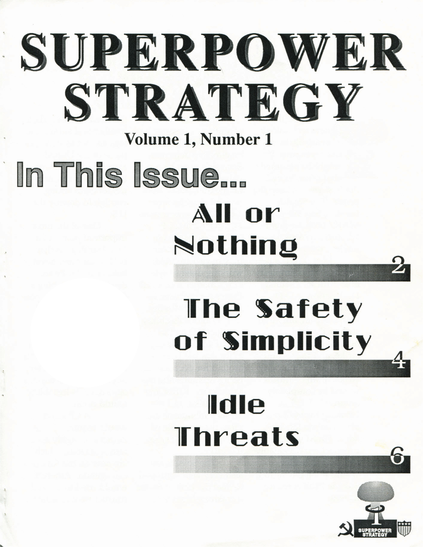
Table Of Contents
All Or Nothing (first spread)
The Safety Of Simplicity (second spread)
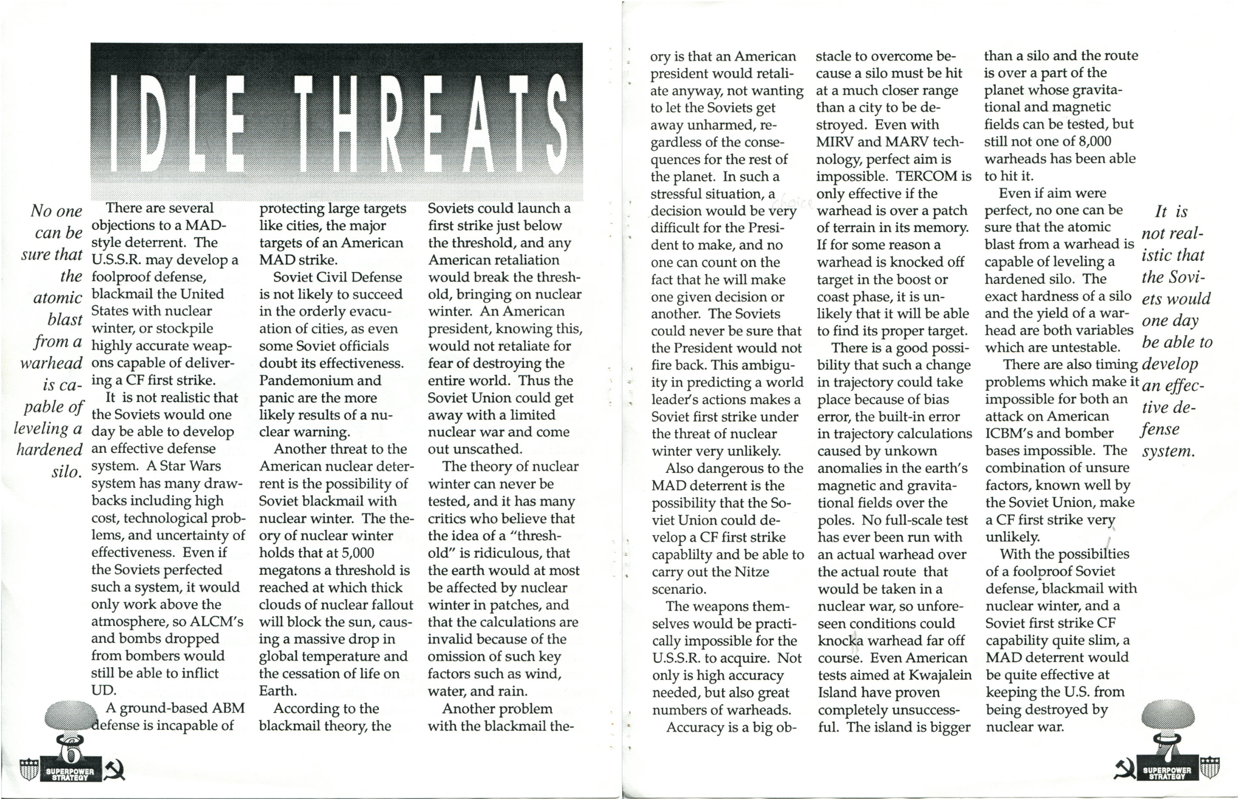
Idle Threats (third spread)
Back Cover
PDF: Superpower Strategy Magazine (page-by-page)
PDF: Superpower Strategy Magazine (spread-by-spread)
Simplified format version:
PDF: Superpower Strategy Magazine - MAD Issue
Bonus material:
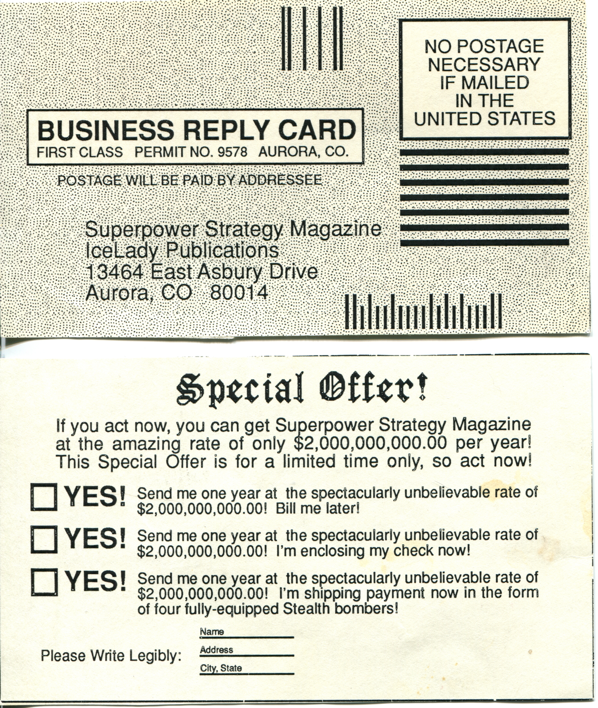
Business Reply Card (subscription card)
The story of the paper:
I wrote a magnificent paper in 1989 when I was 17 years old for a class called US-Soviet Relations. In this class we studied the overall Cold War conflict between the US and USSR, and we discussed global nuclear strategy in depth. This class was extremely popular because we had an amazing teacher.
The class was restricted to seniors only, because it was in such high demand. We covered other conflicts as well, not just the Cold War.
A prior, much shorter paper about nuclear strategy was about the Nitze scenario, which if I remember correctly involved considering a Counter-Force first strike a credible option. Our teacher made it very clear that this was not going to be a good strategy, because it would incentivize a first strike. The danger was that someone might actually do it.
For our final paper, we had to come up with a global nuclear strategy and defend it. I chose MAD, Mutually-Assured Destruction, and decided to make my paper in the form of a magazine.
I was on the Yearbook staff as one of the head editors, so I spent at least two hours every day after school in the Yearbook office working on the paper. I was the Computer Editor, responsible for teaching the other Yearbook students how to use Aldus PageMaker and Aldus Freehand to make camera-ready artwork for the Yearbook.
We had 7-8 networked Macintoshes and a laser printer. Not many schools had that level of equipment in the 80’s, but my school district was very well-funded. We used the Macintoshes to the fullest and made very sophisticated Yearbooks that won high-level national awards year after year.
I had read the Aldus Freehand 2.0 manual cover-to-cover, and was often playfully making all kinds of creative headline styles to test out various techniques. Some of the section editors liked my work so much that they used those styles or variations on them for their sections in the Yearbook.
For my nuclear strategy paper, I really stretched my capabilities to do vector graphics in the most sophisticated manner I could, to try to impress the teacher. We only had a small number of fonts to choose from, and I used several in my paper.
I spent a great deal of time on the visual presentation once I decided to make my paper look like a magazine.
I even made a Business Reply Card where you could order a subscription to Superpower Strategy Magazine. It was just an addition for “flavor”, and I made it look realistic.
I spent a lot of time on the page numbers in particular, making vector stars with precisely-calculated angles for the small shield with stars and stripes that was the icon representing the US. For the USSR, I made a hammer and sickle. Each page number also featured a mushroom cloud. The page numbers took a lot of time to render because of the number and complexity of the vectors and gradient fills involved, but I was very pleased with how they turned out. It’s kind of emblematic of the level of work I put into it, including the smallest details.
I used built-in PostScript fills native to the printer for some of the graphics of the magazine and the Business Reply Card. I had to enter PostScript commands in Freehand when setting up the fills to be able to use them. Freehand was very sophisticated software for its time, which was before desktop publishing really took off.
Somewhere in the Freehand files I found some clip art items, but there were not very many to choose from. Luckily, I found a world map that I was able to use on the cover, and on the back of the magazine I credited the artist who made it. I designed the rest of the paper to look like a real magazine as much as I could. A lot of the visual presentation may look rather dated, but keep in mind, this paper was written over 30 years ago.
A lot of the design was just playful, stretching my abilities with the software just to see what I could do. I had an extraordinary amount of creative energy, which I channeled into creating this paper.
I spent so much time working on the visual presentation that I hadn’t written any text up until the last day or two before the due date. So the main text was written very quickly after everything else was done. I was a stellar student and I had very good notes, so I was able to write excellent text as well.
I turned in my paper and hoped it would knock the teacher’s socks off, and it definitely did. I heard that he was showing it around to other teachers in the teachers’ lounge, and a math teacher who saw it even gave me a card that said “Thank you for renewing my faith in American education.”.
All in all that class was amazing, and I am very grateful that I got to take it.